10 Apartment Web Design Trends That Defined 2015
As we round out 2015 and prepare to welcome a new year, it’s a great time to step back and look at the most defining web trends of the year.
I’ve taken a close look at which web features were most attractive and engaging to viewers this year, so you can go into 2016 armed with tips and tools for strengthening your apartment community’s website.

#1 Responsive Design
As mobile devices continue to get bigger, so too does mobile traffic to apartment websites. This year, almost every apartment website we came across used responsive design (optimized for mobile, tablet and desktop). Good thing.
Fact: Mobile use has gone beyond the tipping point this year. Mobile digital media time in the US is now significantly higher at 51% compared to 42% desktop use. In other words, if you’re not reaching residents through mobile search or display or providing a mobile-friendly experience, you will miss out on attracting prospects.
Best practices:
- Test the responsiveness of your website on multiple mobile devices
- Test load times as well for both mobile and desktop

#2 Large Background Images
One of the top trends used in apartment website design in 2015 were large background images, otherwise known as hero images. “Hero images” refer to filling the entire background of your site with one large image. The end result is an immersive visual effect that pulls users into your apartment site. Just about every new apartment website we came across at Resident360 had this effect.
Important note – If you intend to use a large background image, make sure you put a call to action on top of the image to get visitors deeper into your website. For example, the call to action text could be, “Luxury 1 & 2 Bedroom Apartments” then have a clickable button that says, “View Floor Plans.” This button would take the visitor directly to your rates and floor plans page.
Best practices:
- Use high-quality images
- Employ filters and emphasize bright colors to draw in visitors
- Have a clear call-to-action overlay on the image
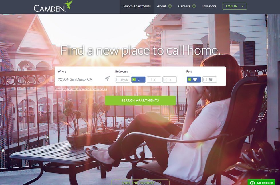
Camden Living (below) does a great job of their hero image with a call to action overlay.
Another good example of a hero image is from Scully Company’s The St. James (below).

#3 Parallax Scrolling
Parallax scrolling, which emerged several years ago, continues to be a hot technique that’s proving to have staying power.
You might be asking yourself, “What the heck is parallax scrolling?” Here’s a non-technical definition – A visitor scrolls down the home page of your website and the foreground reveals the background. Another way to think about it – Imagine a curtain being lifted on a theatre stage to reveal the set – except, with parallax there can be multiple curtains and different sets.
What draws most web designers to this feature is its ability to engage viewers and make them feel like they’re interacting with the page. Plus, it just looks really sleek when done right, almost cutting edge.
Benefits of parallax design:
- Increases engagement and creates curiosity
- Entices and entertains visitors with animation
- Boosts credibility of the website
Check out Helix Starkville (below) by Homestead Development Partners.

#4 3D Floor Plans
2015 witnessed a mass exodus from the traditional 2D floor plan on apartment websites to a new, improved 3D floor plan. The 3D effect creates an outstanding visual, which has been linked to improved time on page from a web user perspective. At Resident360, almost every website we designed in 2015, the request was made to upgrade to 3D floor plans. I think 2016 will bring even more technology and improvements to how floor plans are viewed online. We’re just scraping the surface here…
Best practices:
- Show the actual floor plan rather than simply using the words “View Floor Plan”
- Enlarge the 3D floor plan when clicked

#5 Long Scrolling
Long scrolling became popular way before mobile users exceeded desktop users. In fact, it was social media platforms, such as Facebook and Twitter, that proved users were willing to scroll “below the fold” to acquire content.
Long scrolling refers to single-page and infinitely scrolling websites. For example, you know you’re on a long scrolling website when you click on a navigation item like, “Amenities” and the website scrolls down to that particular section. It’s basically one long page. In the multifamily space, the only long scrolling websites I come across are typically luxury properties. These websites are usually custom designed, command a high price point and appear cutting edge when done right. Especially when you blend high end graphics with beautiful photography. The end result can be extraordinary.
Best practices:
- Use a sticky navigation menu or a jump-to-section option to improve navigation.
- Couple long scrolling with effects such as parallax and scrolling-triggered animations to add interest to your page.
Here’s a good example of a long scrolling website, The Aspire (below):

#6 Neighborhood Pages
Location, location, location. You’ve heard it a million times before, but 2015 really proved to be the year of the location page, otherwise known as the “Neighborhood” page. With custom Google Maps, high-end photography and cleverly written text, the location page has finally made its way to apartment websites. Moving into 2016, it will be necessary requirement for any new apartment website that is indeed in a decent location.
Best practices:
- If creating a custom map, make it VERY user friendly
- Use captivating photos to sell the location
- Don’t be afraid to link out to neighborhood icons (bars, restaurants, hot spots)
- Think outside the box
Check out the neighborhood page on The Vermont (below):

#7 Video Backgrounds
2015 saw a movement toward new styles of apartment videos – drone, lifestyle, tours, etc. Another area that gained momentum was the use of video as an actual background on an apartment website. For example, at Resident360 we replace a large background image on the home page of one our apartment websites with a video background of moving water and boats. The end result was this video background enhanced the overall look of the website.
In 2016 this trend will be a standard on custom luxury apartment websites.
The Runway (below) does a great job of implementing video backgrounds in their design:

#8 Bold Typography
One of the most common uses of typography this year has been extreme size. This could be large or small — the trend is simply bringing typeface to its extremes. Typography not only conveys important information it also has a significant impact on viewers’ perceptions about your site – so it’s definitely worthwhile to take your time choosing the right fonts for your apartment site. Consider how you perceive a message written in Times New Roman versus Comic Sans. In other words, like a photo, typography can be worth a thousand words.
I’m personally fascinated with typography. You can take a website that looks mediocre, apply a new font and font size and you’ll have a totally different look and feel. Something to think about, if you’re growing tired of your current website.
Best practices:
- Start with just two fonts per site. It’s OK to experiment with more typefaces, but for simplicity stick within the same typeface family.
- Avoid hard-to-read fonts. The primary goal of typography is legibility and readability. It doesn’t matter how fancy or artistic your typeface is if no one can read it.
- Bold typography can take over the role of an image on the page. For a clear call-to-action, use bold text that draws viewers to the central focus, which may be to call your office and schedule a tour.
925 Common (below) is filled with bold typography:

#9 Apartment Blogs
They’ve been around for years, but 2015 saw more apartment websites sporting fancy new blogs than ever before. Large management companies like Bozzuto have embraced keeping the resident and prospects alike updated via a blog on their website. Hey, why not? Updated content keeps your website looking fresh. Plus, Google loves websites that consistently publish new content. A true Win-Win. The only downside is someone has to manage the writing and publishing of the content.
Best practices:
- Use good imagery in your blog posts
- Focus on what’s happening locally in the area for more visibility
- Keep it simple, well-written and error-free
Here’s a good example of an apartment website blog from Bozzuto’s Cadence at Crown property (below):

#10 Resident Reviews
Management companies finally started to take online reputation seriously, and 2015 saw innovated strategies for showing off resident reviews right on the apartment website. Why not? Prospects are buying everything these days based off reviews. Give your community a hand up and don’t rely on ApartmentRatings.com or Yelp to sell your community. Get those reviews on your own website.
Gaines Investment Trust established a creative solution by adding a “Resident Reviews” page showcasing residents holding up positive review signs (below).

Commercial Realty Co. is adding resident video testimonials to the homepage of their apartment websites.

Wrapping Up & What’s Next
Overall, 2015 saw a big jump in beautiful apartment websites. Companies are taking their websites more serious, and it’s starting to show.
For 2016, I think we’ll see more of the same with a bigger emphasis on video backgrounds and creative ways to showcase resident reviews. I’d also like to note that interactivity – fun animations, chat, text, and offbeat things like local weather reports, surf reports, and snow reports will become popular widgets on apartment websites in 2016.

Written by Josh Grillo
Josh Grillo is a #1 Best Selling Author, Speaker and Co-Founder of Resident360.