The Ultimate Guide To Apartment Logo Design
If someone asked you to identify the Nike or McDonald’s brand logo, there is probably a 100% chance you could. So, what made that simple swoosh or those golden arches so memorable?
And more importantly, how do you create a logo that is perfect – and just as memorable – for your apartment community?
First off, you may be wondering, how important is apartment logo design anyway? And the answer is simple: very. According to an article by crowdspring.com, it takes 10 seconds for a brand logo to make a first impression. However, a customer has to see that logo five to seven times before actually recognizing it.
![]()
Your apartment logo sets your community apart, identifies your values, can attract the right attention, and can leave a lasting impression. So, where do you start? You’re in the right place. Here are our top SIX tips for effective apartment logo design.
Tip #1: Simplify, Simplify, Simplify
You get the idea; keep it simple and clean, so your message is clear. You want people to be able to make the connection between your logo and your apartment community, quickly. It may be tempting to create an apartment logo design that is over the top and complex because you think that will make it stand out in the marketplace. However, in reality, customers always respond to the ‘less is more’ approach. They recall uncomplicated logos, and simple designs tend to stand the test of time.
Simple logos are more difficult to create, as they are essentially telling your entire brand story in just one super clear-cut visual. Think of Apple’s simple, crisp logo of an apple – pretty effective and memorable, huh? That said, take the time to really hone in on what matters to your brand identity and have a well thought out, clean design.
Let’s take a look at some examples of effective apartment logo designs.
![]()
Tip #2: Choose Fonts Carefully
The countless options out there can be overwhelming. First, think about what you want people to know about your apartment community – is it luxurious and high end, chic and modern, or woodsy and eco-friendly? Is it a hip brownstone or sleek high rise?
Once you’ve established your style, find a font that matches that style. The key is readability – don’t get so fancy pants that your audience doesn’t know what it says.
You’ll want to stick to just one or two different font styles that complement each other. Any more than that may make the logo look messy and confusing (don’t forget our first point about keeping your logo simple!).
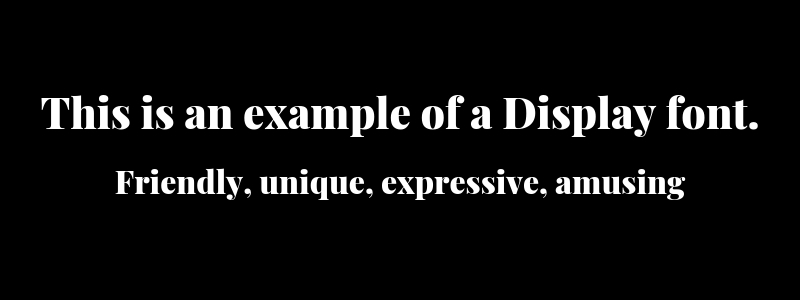
We also recommend using a more traditional font, rather than a trendy one. Some of the main fonts include: Serif, Sans Serif, Display, Script, and Modern. There is a psychology behind each font style – meaning each style can deliver a certain feeling or emotion to your potential residents. Here is a quick guide:
Serif: Traditional, respectable, reliable, comfortable

Sans Serif: Clean, modern

Display: Friendly, unique, expressive, amusing
Script: Elegant, creative, affectionate

Modern: Strong, progressive, stylish

Based off the above list, decide which characteristics best describe your brand and choose your apartment logo font accordingly.
Tip #3: Use Colors that Speak to Your Audience
Don’t just choose a color because you like it – it should also make sense for your brand and be visually appealing. Color is the first thing that pulls a potential customer in and can enhance your apartment logo’s legibility.
According to colormatters.com, 60% of the time, people will choose a brand based on color alone and a signature color increases brand recognition by 80%. For example, you can spot that red and gold McDonald’s logo or green Starbucks logo miles away, even while zooming down the highway, right?
It’s important to remember that each color has a meaning all on its own and evokes certain feelings and inspires certain actions in consumers. Research the psychology of colors, and decide how you want your audience to react to your logo.
The most-used color for logo designs is actually the color blue, followed by red, then black, and lastly yellow. You can either take your cue from major brands that have incorporated these colors, or try something unique to your brand. Here is a quick cheat sheet on color psychology to consider when selecting the right apartment logo design color:
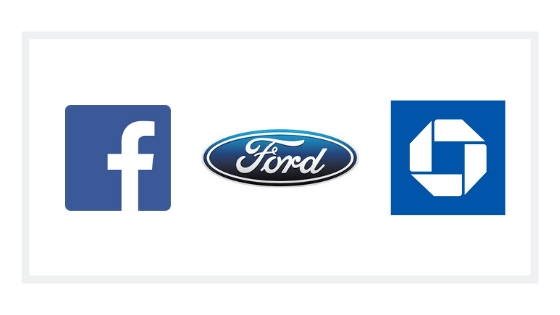
Blue: Calming; evokes trust, honesty, and dependability (probably why it’s used by so many companies). Used by major brands, including Facebook, Chase Bank, Ford.
Black: This gives a high-end, VIP feeling. Used by Apple, Gucci, Lexus, Prada, Adidas, Chanel. Pair black with the color gold or white for a particularly posh, five-star apartment logo design.

Orange: This gives a fun, whimsical, even childlike vibe. Brands like Nickelodeon, Fanta, Shutterfly, and Amazon all incorporate this bright, poppy color into their logos.

Brown: Popular for apartment logo design, brown evokes the feeling of being grounded and stable, which is what you think of when you think of home. UPS famously uses the color brown in its marketing, as does M&Ms, Cotton, and A&W Root Beer.

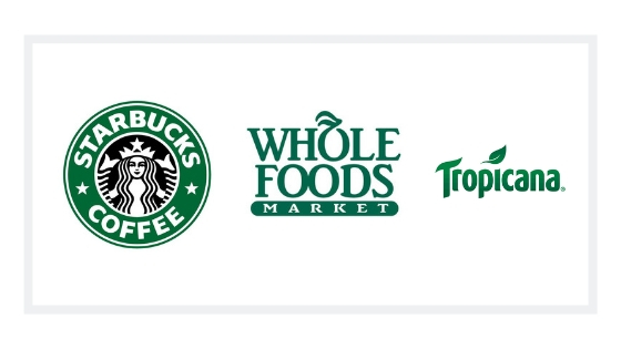
Green: Another popular color for apartment logos, green gives the feeling of connectedness to the earth, nature, tranquility, and health. Starbucks, Tropicana, and Whole Foods are all earthy brands that use the color green in their logos.
Red: The color of energy and excitement, red inspires action and movement. Big brands, like Coca Cola, Netflix, Target, Nintendo, Quicksilver, and Red Bull use big, bold red in their logos.

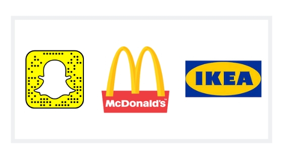
Yellow: Gives the impression the brand is cheerful, friendly, inviting, or fun. Used by McDonald’s, Denny’s, Kodak, Snapchat, IKEA (just to name a few).
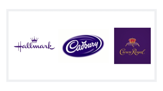
Purple: The color of royalty; evokes luxury and also wisdom. Purple can also elicit creativity. Used by Hallmark, Cadbury, Crown Royal.
Play around with color combinations – like bright bold colors versus one pop of color with one neutral or muted color. Or, see how just one strong color paired with white works for your brand. For example:
This logo uses bright, bold complementary colors on a white background.
![]()
This logo is simple and clean with one small pop of color for effect.
![]()
Also consider trends – for apartment logo design, you’ll want to use colors that remain relevant, even with the passing trends (like, neon pink was cool in the 80s and has kind of made a comeback recently, but will it last?).
As a rule of thumb, use no more than three colors in your logo, although we recommend keeping it to just two, as the most successful logo designs take a minimalist approach.
Tip #4: Images Must Be Meaningful
By nature, humans process visual imagery faster than text alone, which is why so many logos will include some type of symbol or character along with the brand name. Some bigger brands don’t even include text, and just use a symbol on its own (think Apple). In today’s digital world especially, we practically communicate in solely symbols, like emojis. So, visuals are particularly important to communicating your main message to your audience.
We suggest choosing imagery that resembles an important aspect of your apartment community. For example, brick elements, or forest, beach, or city imagery. This is a perfect opportunity to communicate one critical component of your apartment community that you want the consumer to know about.
This logo below works well because the fun color combination matches the playfulness of the apartment community name. Additionally, the q in the name “Sparq” shows a subtle little spark for a supporting visual.
![]()
Below, the arches around the text symbolize a bridge, which is also a subtle visual that supports the apartment community name A simple black and white color choice gives a high-end, luxury feel.
![]()
Avoid clip art or stock photography – people will see right through your DIY logo and lose respect for your brand. Plus, you want your logo to be completely unique, just like your apartment community.
Another consideration is that the logo needs to match the quality of your property. For example, if you’re doing an asset reposition or rebrand, you’ll want to update your logo as well.
Some other considerations when choosing imagery or graphics are:
Make sure that the logo will work on both digital and print collateral. For print, you will need it to be a high enough resolution so it doesn’t look grainy – 300 DPI minimum should print clearly.
Remember that orientation matters – if it’s too horizontal or too vertical, it may not work on all of your marketing assets. It needs to be able to function on every scale, from large monument signs to websites, business cards, and any other collateral.
Tip #5: Don’t Forget the Style Guide
The logo style guide will include all of the important specifics of your logo, so you can ensure consistency across every single marketing piece you create. This guide will include the pantone colors used, the exact size specifications, fonts used, and any other pertinent details of the logo. You will then be able to hand this guide over to any designer, and he or she will be able to recreate the logo to perfection. It is imperative that the logo be exactly the same on every usage.
![]()
Make sure your logo designer knows that you expect to receive these guidelines at the completion of the project.
Tip #6: Our Last Word of Advice: Hire an Expert
Your logo is probably the most important aspect of developing your apartment brand identity. All your marketing efforts that follow will be built off of it, so it’s important to get it right the first time (no excuses!). You don’t have to necessarily shell out the big bucks for a good quality logo design for your apartment community (that Nike swoosh was designed by an intern after all). Whether you go to a seasoned professional or a fresh-out-of-college graphic designer, find someone who knows what they’re doing and can offer smart designs for your apartment community.
Here are some important questions to ask when choosing a partner to design your apartment logo:
![]()
- How many rounds of revisions will I get?
- How long is the logo process and when can I expect my final logo?
- Who will be my point of contact?
- What does the creative process entail?
- What will the final deliverable be?
- What happens if I don’t like my logo?
- Will I receive the logo style guide once the logo is finalized?
By asking these questions upfront, you will set clear expectations for your design and can feel confident you are putting your apartment logo design in the right hands. Invest the time and energy into a strong design that can stand the test of time and leave a lasting impact on your audience.
Have any logo advice to add? Let’s hear it in the comments.

Written by Josh Grillo
Josh Grillo is a #1 Best Selling Author, Speaker and Co-Founder of Resident360.